Google redesigns navigation bar for consistent user experience


Highly rated gadgets
-
9.0
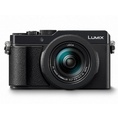 Panasonic LUMIX LX100 II
-
10.0
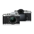 FujiFilm X-T3
-
9.0
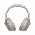 Sony WH-1000XM3
-
8.0
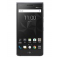 BlackBerry Motion
-
10.0
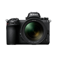 Nikon Z 7
-
9.1
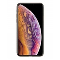 Apple iPhone XS
-
9.1
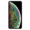 Apple iPhone XS Max
-
8.5
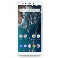 Xiaomi Mi A2
-
9.0
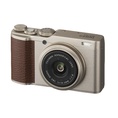 FujiFilm XF10


Search giant Google’s just announced a completely redesigned navigation bar that aligns with the redesigns we’ve already seen for Google Search, Maps, News, Reader, and Gmail. The dark gray on top has finally been removed, the redesigned bar opting for a light gray tone across all Google products for a more consistent user experience. Hovering your mouse pointer over the Google logo drops down a menu with links to Google+, Image Search, Maps, and other products, gone are the static links for Google Calendar or Docs. The Google+ push clearly continues here with a share button integrated across all Google properties (something that Google is seemingly trying to do with every Google product the... »read more
More at: SlashGear Add additional source
Filed in: Google